Skipper Hospitality Booking Engine · Product Design

Uncovering why customers struggled in the portal and fixing what mattered most

Research-led

Usability testing

Customer portal

Retention

Sole designer

I led an end-to-end usability study of Spot & Tango's customer portal — designing the research protocol, facilitating 7 sessions across 5 departments, and synthesizing findings into a prioritized roadmap. Three improvements shipped, including a navigation change that directly reduced cancellation rates.

7

Usability sessions

Across 5 departments

3

Improvements shipped

From research to production

↓ CX

Cancellation tickets

Post nav update

↑ Saves

Cancel save rate

Portal vs. phone

01 · Context

About the project

Spot & Tango's customer portal is the primary self-service tool for subscribers — covering rescheduling, adjusting portions, managing add-ons, and cancelling plans. Getting these flows right is directly tied to subscriber retention and lifetime value.

Despite the portal's importance, it had never been formally usability tested. CX team feedback suggested customers regularly struggled with core tasks — but without structured research, we couldn't prioritize what to fix. I proposed and led this study as part of an evergreen retention initiative.

My role

Sole Product Designer

Team

1 PM, 2 engineers

Timeline

Team

~3 months, 2024-2025

1 PM, 2 engineers

Tools

Figma, User Teting, Data Dog

Tools

Figma, User Teting, Data Dog

Timeline

~3 months, 2024-2025

Research questions

1

Where does the portal break down?

What are the main friction points users encounter?

2

Which tasks cause the most confusion?

Where do users drop off, and why?

3

What would reduce CX ticket volume?

Which improvements map to measurable retention outcomes?

Business case

Improving the portal was part of an evergreen retention project — a more usable portal would reduce churn by keeping customers from reaching out to cancel, and by making the experience feel worth continuing.

Phase 01

Research Setup

Designing the study

I structured the study as a moderated remote usability test using a staging portal. Participants were internal employees from Marketing, Ops, Strategy, CX, and Finance who were unfamiliar with the portal's day-to-day usage — giving us fast access to engaged testers without external recruitment lead time.

I wrote the test script, facilitated all sessions over Zoom, and synthesized findings in Notion. I also used Data Dog session recordings alongside live sessions to triangulate behavioral patterns across a wider sample.

Participants were given realistic scenarios rather than direct instructions — so we could observe natural navigation choices, not just task completion.

Participants

Mike

Marketing

Bailey

Strategy

Georgia

Marketing

Kieran

Finance

Shohini

Ops

Sara

CX

Lexi

Finance

Test tasks

1

Rescheduling flow

Reschedule your dog's next order to a future date

2

Portion adjustment

Adjust the amount of food your dog gets

3

Cancellation path

Cancel a dog's plan

4

Recipe change

Change your dog's recipe

5

Add-on process

Add a snack or supplement to your dog's plan

6

Removal process

Remove a snack or supplement from your dog's plan

Phase 02

Findings

What we learned

The portal was functional — every participant eventually completed every task. But the average error rate of 1.3 errors per task was nearly double the 0.7 industry benchmark, and qualitative feedback consistently pointed to the same themes: unclear navigation, missing feedback, and a mismatch between where users looked for things and where they actually were.

Cancellation was the starkest finding. Every single participant struggled to find it. This wasn't just a UX issue — it had a direct business cost. Customers who couldn't find cancel on the portal called CX instead, where cancellation rates were significantly higher.

Usability metrics

100%

Task completion rate

All tasks eventually completed

1.3 / task

Error rate

vs. 0.7 industry benchmark

Cancel · 3:25

Slowest task

Deep path + multi-step friction

Remove snack · 1:00

Fastest task

Simple, linear flow

Findings by severity

Cancellation

Critical

7 of 7

Every participant failed to find cancel on first attempt

Cancellation was hidden behind the profile icon — no participant associated it with plan management. Most looked in Orders, then Dogs, before giving up. Multi-step process added further friction once found.

Reschedule

High

6 of 7

Charge vs. delivery date caused consistent errors

Participants misread the reschedule UI — attempting to move delivery dates when the interface showed charge dates. Avg completion time 2:10, with most making wrong navigation attempts first.

Portion size

High

5 of 7

No feedback on price impact of portion changes

When participants adjusted portion size, they expected real-time pricing updates. None existed. Several assumed price wouldn't change — which eroded trust.

Shop / add-ons

Medium

5 of 7

Product cards weren't visibly interactive

Participants didn't realize product cards were clickable. The bestseller carousel was mistaken for decorative content. Several added items without realizing they were recurring add-ons.

Navigation

Medium

All

Mobile navigation caused disproportionate difficulty

Static nav on mobile was a consistent pain point. Profile icon was frequently missed. 'Too many CTAs' and 'Felt like work to find what I needed' were the most common post-session comments.

Participant voices

"I don't know where to go next. Is cancellation even on this page?"

Participant — cancellation task

"I changed my portion size but I have no idea if my price just went up."

Participant — portion size task

"Too much scrolling. Felt like work to find what I needed."

Multiple participants — post-session

Participant voices

Cancellation

Critical

7 of 7

Every participant failed to find cancel on first attempt

Cancellation was hidden behind the profile icon — no participant associated it with plan management. Most looked in Orders, then Dogs, before giving up. Multi-step process added further friction once found.

Reschedule

High

6 of 7

Charge vs. delivery date caused consistent errors

Participants misread the reschedule UI — attempting to move delivery dates when the interface showed charge dates. Avg completion time 2:10, with most making wrong navigation attempts first.

Portion size

High

5 of 7

No feedback on price impact of portion changes

When participants adjusted portion size, they expected real-time pricing updates. None existed. Several assumed price wouldn't change — which eroded trust.

Shop / add-ons

Medium

5 of 7

Product cards weren't visibly interactive

Participants didn't realize product cards were clickable. The bestseller carousel was mistaken for decorative content. Several added items without realizing they were recurring add-ons.

Navigation

Medium

All

Mobile navigation caused disproportionate difficulty

Static nav on mobile was a consistent pain point. Profile icon was frequently missed. 'Too many CTAs' and 'Felt like work to find what I needed' were the most common post-session comments.

Phase 03

Prioritaztion

What we learned

The portal was functional — every participant eventually completed every task. But the average error rate of 1.3 errors per task was nearly double the 0.7 industry benchmark, and qualitative feedback consistently pointed to the same themes: unclear navigation, missing feedback, and a mismatch between where users looked for things and where they actually were.

Synthesis insight

The portal was designed for the happy path. Every major pain point involved a moment where users needed more context or flexibility than the current design provided.

Recommendation stack

Add account option to navigation bar

Ship now

Cancellation was universally hard to find. Surfacing account/plan management in nav reduces friction and CX contact volume.

Add 'Shop all' CTA to bestseller carousel

Ship now

Users missed the full shop. A single CTA bridges the discovery gap and drives add-on revenue.

Add skip order functionality

Ship next

Customers wanting flexibility often cancelled instead. Skip order reduces churn trigger without requiring cancellation.

Show live price updates on portion change

Ship next

Users didn't trust the flow without real-time feedback. Transparency reduces anxiety and CX questions.

Clarify charge vs. delivery date in reschedule

Ship next

Consistent source of errors. Copy and hierarchy tweaks can resolve this with minimal engineering effort.

Explore sidebar navigation for mobile

Explore

Mobile nav is fundamentally broken. Long-term this needs a structural solution, not just copy fixes.

Add account option to navigation bar

Ship now

Cancellation was universally hard to find. Surfacing account/plan management in nav reduces friction and CX contact volume.

Add skip order functionality

Ship next

Customers wanting flexibility often cancelled instead. Skip order reduces churn trigger without requiring cancellation.

Clarify charge vs. delivery date in reschedule

Ship next

Consistent source of errors. Copy and hierarchy tweaks can resolve this with minimal engineering effort.

Add 'Shop all' CTA to bestseller carousel

Ship now

Users missed the full shop. A single CTA bridges the discovery gap and drives add-on revenue.

Show live price updates on portion change

Ship next

Users didn't trust the flow without real-time feedback. Transparency reduces anxiety and CX questions.

Explore sidebar navigation for mobile

Explore

Mobile nav is fundamentally broken. Long-term this needs a structural solution, not just copy fixes.

Participant voices

"I don't know where to go next. Is cancellation even on this page?"

Participant — cancellation task

"I changed my portion size but I have no idea if my price just went up."

Participant — portion size task

"Too much scrolling. Felt like work to find what I needed."

Multiple participants — post-session

Phase 03

Prioritization

What we learned

The portal was functional — every participant eventually completed every task. But the average error rate of 1.3 errors per task was nearly double the 0.7 industry benchmark, and qualitative feedback consistently pointed to the same themes: unclear navigation, missing feedback, and a mismatch between where users looked for things and where they actually were.

Synthesis insight

The portal was designed for the happy path. Every major pain point involved a moment where users needed more context or flexibility than the current design provided.

Add account option to navigation bar

Ship now

Cancellation was universally hard to find. Surfacing account/plan management in nav reduces friction and CX contact volume.

Add skip order functionality

Ship next

Customers wanting flexibility often cancelled instead. Skip order reduces churn trigger without requiring cancellation.

Clarify charge vs. delivery date in reschedule

Ship next

Consistent source of errors. Copy and hierarchy tweaks can resolve this with minimal engineering effort.

Add 'Shop all' CTA to bestseller carousel

Ship now

Users missed the full shop. A single CTA bridges the discovery gap and drives add-on revenue.

Show live price updates on portion change

Ship next

Users didn't trust the flow without real-time feedback. Transparency reduces anxiety and CX questions.

Explore sidebar navigation for mobile

Explore

Mobile nav is fundamentally broken. Long-term this needs a structural solution, not just copy fixes.

Recommendation stack

From findings to a prioritized roadmap

With findings synthesized in Dovetail, I presented to the PM, CX lead, and engineering team and co-prioritized recommendations against effort and business impact. The goal wasn't to fix everything — it was to identify changes most likely to reduce CX ticket volume and improve retention within the current quarter.


Synthesis insight

The portal was designed for the happy path. Every major pain point involved a moment where users needed more context or flexibility than the current design provided.

Recommendation stack

Add account option to navigation bar

Ship now

Cancellation was universally hard to find. Surfacing account/plan management in nav reduces friction and CX contact volume.

Add 'Shop all' CTA to bestseller carousel

Ship now

Users missed the full shop. A single CTA bridges the discovery gap and drives add-on revenue.

Add skip order functionality

Ship next

Customers wanting flexibility often cancelled instead. Skip order reduces churn trigger without requiring cancellation.

Show live price updates on portion change

Ship next

Users didn't trust the flow without real-time feedback. Transparency reduces anxiety and CX questions.

Clarify charge vs. delivery date in reschedule

Ship next

Consistent source of errors. Copy and hierarchy tweaks can resolve this with minimal engineering effort.

Explore sidebar navigation for mobile

Explore

Mobile nav is fundamentally broken. Long-term this needs a structural solution, not just copy fixes.

Add account option to navigation bar

Ship now

Cancellation was universally hard to find. Surfacing account/plan management in nav reduces friction and CX contact volume.

Add skip order functionality

Ship next

Customers wanting flexibility often cancelled instead. Skip order reduces churn trigger without requiring cancellation.

Clarify charge vs. delivery date in reschedule

Ship next

Consistent source of errors. Copy and hierarchy tweaks can resolve this with minimal engineering effort.

Add 'Shop all' CTA to bestseller carousel

Ship now

Users missed the full shop. A single CTA bridges the discovery gap and drives add-on revenue.

Show live price updates on portion change

Ship next

Users didn't trust the flow without real-time feedback. Transparency reduces anxiety and CX questions.

Explore sidebar navigation for mobile

Explore

Mobile nav is fundamentally broken. Long-term this needs a structural solution, not just copy fixes.

Phase 03

Phase 04

What Shipped

Shipped 02

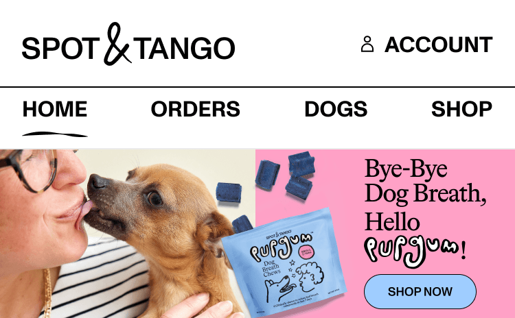
'Shop all' CTA added to bestseller carousel

Findings

Participants consistently missed the full shop. The bestseller carousel was understood as decorative — not as an entry point. Several participants didn't realize there was a broader shop accessible from the home page at all.

solution

Added a 'Shop all' CTA to the bestseller carousel, linking directly to the Shop tab. A single, clear action bridged the gap between discovery and conversion.

Outcome

Improved discoverability of add-ons from the home page, increasing the surface area for Shop tab entry. Expected to contribute to AOV improvements as more customers discover the full product range.

orders

homepage

orders

Shipped 01

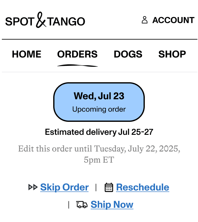
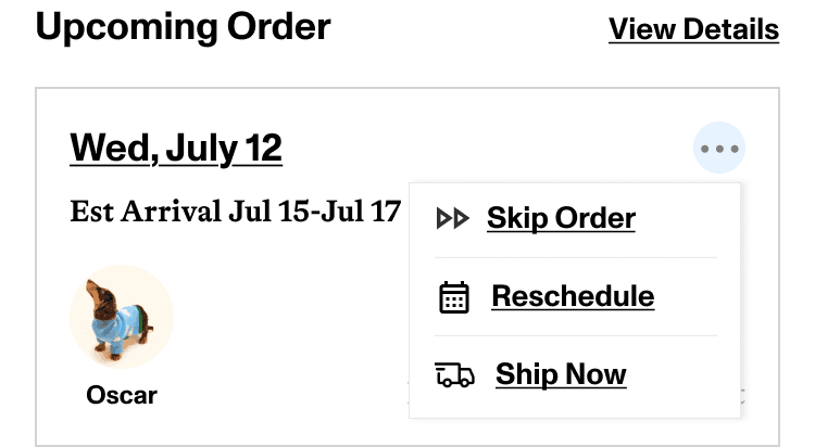
Skip order functionality

Findings

Customers needing temporary flexibility — a vacation, financial pressure, lower appetite — had no way to pause without cancelling. Several participants went directly to cancellation when they couldn't find a skip option, treating cancel as a last resort they'd been forced into.

solution

Added skip order functionality to the portal, giving subscribers the ability to skip a delivery without cancelling their plan. This addressed a core retention risk: customers were cancelling when what they actually needed was flexibility.

Outcome

Introduced a meaningful save mechanism that keeps customers in the subscription when they need a temporary break. Skip order directly reduces one of the most common churn paths — customers who would otherwise cancel and not resubscribe.

Three changes from research to production

Not every recommendation made it into the immediate sprint — but the three that did were most directly tied to retention and CX ticket reduction.

Before

Before

after

after

Shipped 01

Account option added to navigation bar

Findings

Every participant struggled to find cancellation — buried behind a profile icon no one associated with plan management. Customers who couldn't find it on the portal called CX instead, where they were far more likely to follow through with cancellation.

solution

Added a visible 'Account' option to the main nav bar, surfacing plan management — including cancellation — at the top level. Removed the need to know that cancel lived under a profile icon.

Outcome

CX ticket volume for cancellation decreased post-launch. More importantly, the save rate for customers cancelling via the portal improved relative to phone — because the portal's save flow is more consistent than what CX was delivering.

Shipped 02

'Shop all' CTA added to bestseller carousel

Findings

Participants consistently missed the full shop. The bestseller carousel was understood as decorative — not as an entry point. Several participants didn't realize there was a broader shop accessible from the home page at all.

solution

Added a 'Shop all' CTA to the bestseller carousel, linking directly to the Shop tab. A single, clear action bridged the gap between discovery and conversion.

Outcome

Improved discoverability of add-ons from the home page, increasing the surface area for Shop tab entry. Expected to contribute to AOV improvements as more customers discover the full product range.

orders

homepage

orders

Shipped 02

Skip order functionality

Findings

Customers needing temporary flexibility — a vacation, financial pressure, lower appetite — had no way to pause without cancelling. Several participants went directly to cancellation when they couldn't find a skip option, treating cancel as a last resort they'd been forced into.

solution

Added skip order functionality to the portal, giving subscribers the ability to skip a delivery without cancelling their plan. This addressed a core retention risk: customers were cancelling when what they actually needed was flexibility.

Outcome

Introduced a meaningful save mechanism that keeps customers in the subscription when they need a temporary break. Skip order directly reduces one of the most common churn paths — customers who would otherwise cancel and not resubscribe.

Shipped 02

'Shop all' CTA added to bestseller carousel

Findings

Participants consistently missed the full shop. The bestseller carousel was understood as decorative — not as an entry point. Several participants didn't realize there was a broader shop accessible from the home page at all.

solution

Added a 'Shop all' CTA to the bestseller carousel, linking directly to the Shop tab. A single, clear action bridged the gap between discovery and conversion.

Outcome

Improved discoverability of add-ons from the home page, increasing the surface area for Shop tab entry. Expected to contribute to AOV improvements as more customers discover the full product range.

orders

homepage

orders

Shipped 03

Skip order functionality

Findings

Customers needing temporary flexibility — a vacation, financial pressure, lower appetite — had no way to pause without cancelling. Several participants went directly to cancellation when they couldn't find a skip option, treating cancel as a last resort they'd been forced into.

solution

Added skip order functionality to the portal, giving subscribers the ability to skip a delivery without cancelling their plan. This addressed a core retention risk: customers were cancelling when what they actually needed was flexibility.

Outcome

Introduced a meaningful save mechanism that keeps customers in the subscription when they need a temporary break. Skip order directly reduces one of the most common churn paths — customers who would otherwise cancel and not resubscribe.

Phase 05

Outcome & Reflection

Research that directly moved retention metrics

Three changes from this study shipped into production. Each was directly traceable to a specific finding — making this one of the clearest examples of research-to-impact work in my portfolio.

7

Sessions facilitated

Across 5 departments

3

Changes shipped

From 16+ recommendations

↓ CX

Cancellation tickets

Post nav update

↑ Saves

Portal cancel save rate

vs. phone cancellations

The retention insight

The retention insight

Making cancellation easier to find actually improved the business outcome.

Making cancellation easier to find actually improved the business outcome.

Making cancellation easier to find actually improved the business outcome.

Customers who cancelled via the portal went through a save flow. Customers who cancelled via CX were more likely to churn — because the portal save flow was more consistent than what CX was delivering. Reducing friction on a "negative" action improved retention.

Customers who cancelled via the portal went through a save flow. Customers who cancelled via CX were more likely to churn — because the portal save flow was more consistent than what CX was delivering. Reducing friction on a "negative" action improved retention.

Remaining backlog

Clarify charge vs. delivery date in reschedule flow

Show live price/bag updates on portion size change

Make product cards in Shop feel visibly clickable

Improve promo code visibility and real-time price updates

Explore sidebar navigation for mobile — structural fix

What this project taught me about research leadership

This was the first study I designed and facilitated entirely on my own. Before this, most of my research had been in support of a specific feature. This was broader — what's wrong with the portal, and what should we fix first? That open-endedness required a different kind of discipline.

The most valuable lesson was about the gap between task completion and task experience. Every participant completed every task — which could have been reported as "the portal works." But the error rate, the time-on-task data, and the verbal frustration told a completely different story. Numbers without qualitative context are dangerous.

What I'd do differently

I'd recruit external users rather than internal employees for future rounds. Internal participants were engaged and articulate, but they brought more product intuition than a typical customer — which likely masked some navigation failures real subscribers would hit harder.

What surprised me

Making cancellation easier to find improved retention. I expected that surfacing cancel more prominently would increase churn. Instead it pushed more customers through the portal's save flow, which outperformed CX's delivery. Friction isn't always protective.

The B2B SaaS insight

In subscription products, the post-purchase experience is as important as acquisition. This portal study had more retention impact than most acquisition-focused work I'd done — because keeping one customer is cheaper than acquiring a new one. Research that connects UX to retention metrics is the kind that gets resourced.

What came next

Add-ons in booking flow (early check-in, special requests) — highest-priority v2 feature from testing

Multi-CRS integration to support additional hotel clients beyond Journey East Hampton

Analytics dashboard for hoteliers to monitor conversion and drop-off in real time

Expanded design system to support 5+ hotel brands without per-client rebuilds