Skipper Hospitality Booking Engine · Product Design
Giving independent hotels control over their booking experience
Hotels relying on third-party OTAs were losing direct revenue and eroding brand trust every time a guest clicked "book now." I led research and design of a native booking engine that kept guests inside the hotel's own website — from browse to confirmation.
+40%
Direct booking conversions
−10%
5
Hotel clients at MVP launch
01 · Context
About Skipper Hospitality
Skipper Hospitality builds website and booking infrastructure for independent hotels — properties that compete against major chains and OTA-dominated search results without the same technology resources.
As the lead designer on the product team, I owned the booking engine from initial research through shipped MVP. I worked alongside one other designer, a PM, and a team of 3 engineers across approximately 8 months.
My role
Lead researcher + designer
Team
2 designers, 1 PM, 3 engineers
Timeline
~8 months, 2021–2022
Tools
Figma, UserTesting, Maze
Phase 02
Define
02 · Problem
Independent hotels were losing the moment that matters most
When a guest decides to book, that moment belongs to whoever controls the experience. For most independent hotels, that wasn't them.
The industry default was to hand guests off to third-party platforms — OTAs like Expedia or central reservation systems like Sabre Synxis. This redirect happened the instant a guest clicked "book now," breaking the brand experience at the most critical point in the funnel.
Hotels paid steep commissions on every booking made through these channels, and had no access to the guest data captured during the transaction. For small independent properties, this wasn't just a UX problem — it was a revenue and sustainability problem.
"We've built a beautiful brand experience on our website, but the moment someone clicks 'book' it all disappears. We lose them to a page we have no control over."
Hotel manager · Skipper client
"I thought I'd clicked the wrong thing — the page looked completely different from the hotel website. I almost didn't complete the booking."
Guest interview participant
Understanding the booking experience from every angle
Our research spanned several months and drew on multiple sources — from industry reports and competitive audits to direct conversations with hotel managers and their guests. We had a unique advantage: as the team that built hotel websites, we had access to deep site analytics and direct relationships with property managers.
📊
Site analytics
Analyzed booking funnel drop-off data across 4 existing Skipper hotel clients. Identified that 38% of users who clicked 'book now' did not complete a reservation.
🎤
User interviews
5 in-depth interviews with recent hotel guests. Focused on their last hotel booking experience — what they trusted, what made them hesitate.
🔍
Competitive analysis
Audited 8 hotel booking engines including Expedia, Booking.com, Marriott Direct, and independent boutique hotels. Benchmarked against retail checkout flows.
🏨
Stakeholder interviews
Spoke with 3 hotel managers about their current pain points — commission costs, data access, and what they'd most want control over.
Key findings
2 of 5
Guests did not complete their booking after being redirected — citing the URL change and visual mismatch as the reason
38%
Drop-off rate at the 'book now' step across existing Skipper client analytics — the highest exit point in the entire funnel
3 of 3
Hotel managers said they could not capture guest data beyond the 'book now' button — a major CRM and retention limitation
100%
Of competitor engines reviewed required a separate tab or URL — no existing tool offered a fully native, embedded booking flow
Site analytics
user persona


Research synthesis
No existing solution let hotels own the full booking experience inside their own website. The gap wasn't feature parity — it was a fundamentally different technical and UX approach. That became our opportunity.
Phase 02
Define
Turning research into a clear design direction
With research complete, we had enough to crystallize the core problem and set the principles that would guide every design decision. This phase was about making explicit what the research had implied — and aligning the team before a single wireframe was drawn.
Problem statement
Independent hotel guests need a booking experience that feels like a natural extension of the hotel's website — because the moment trust breaks, so does the conversion.
We also defined our constraints upfront. Since this was an MVP, we scoped to a single CRS integration (Journey East Hampton) and a mobile-first approach — which meant desktop would be derived from mobile layouts rather than designed independently.
MVP constraints
Single CRS integration
Journey East Hampton only — multi-CRS support planned post-launch
Mobile-first scope
No add-ons at launch
Early check-in, special requests deferred to v2 based on testing feedback
Brand-agnostic system
Engine had to work with any hotel's visual identity — no hardcoded styles
Phase 03
Design process
Mapping the user flow before touching pixels


Building a brand-agnostic design system
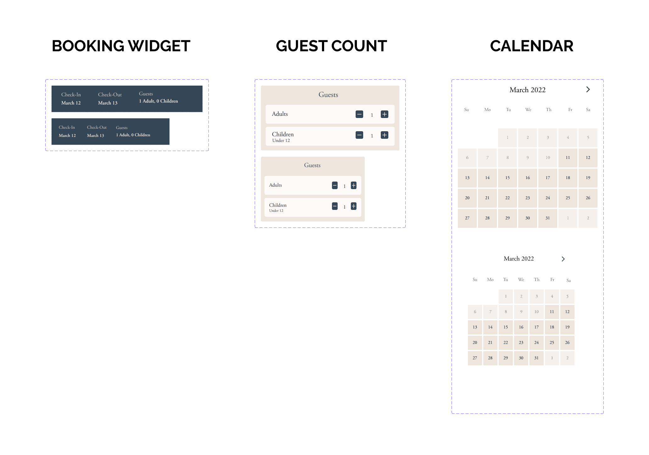
One of the defining technical challenges was that our booking engine needed to look native to any hotel brand — not just Journey East Hampton. I built a component library in Figma with tokenized styles: colors, typography, and radius values that could be swapped out per client without rebuilding any layouts.
For the MVP prototype, I applied Journey East Hampton's existing brand to validate that the system held up under a real client's aesthetic. This also gave us a polished artifact for the client presentation, which led directly to sign-off for development.
The component library covered buttons, date pickers, room cards, guest detail forms, payment inputs, and a confirmation screen — all built to be responsive from 375px mobile upward.

Phase 04
Solution
Each feature was grounded in a specific pain point from research — and each required deliberate design and engineering decisions to get right.

Feature 02
One-click payments via Apple Pay
We integrated Apple Pay directly into the booking confirmation step, reducing payment to a single tap for guests on Apple devices. A standard card entry flow was also available.
Design rationale
No existing hotel booking engine had implemented one-click payments. Retail checkout research consistently shows payment friction is the leading cause of abandonment — applying that lesson to hotel bookings was a clear opportunity.

Feature 01
Native embedded booking drawer
Design rationale
The drawer pattern was chosen over a modal (too interruptive) and a new page (breaks the URL). It keeps guests anchored in the hotel's environment — directly addressing the trust breakdown identified in research.

Feature 02
Web Storage API session persistence
We used the browser's Web Storage API to save the state of incomplete bookings. If a guest left mid-flow and returned — even after closing the tab — their room selection, dates, and details were preserved.
Design rationale
This feature emerged from a design review conversation with engineering. Hoteliers had flagged incomplete bookings as a significant source of lost revenue. The implementation was lightweight, and the design surface was a simple resume prompt.
Phase 05
Testing
What we found
Validating with real users before engineering committed
Test setup
Participants
5 hotel guests via UserTesting.com
Method
Moderated remote usability test
Prototype
High-fidelity Figma, Journey East Hampton brand
Tasks
3 core flows: search → select → pay
Phase 06
Outcome & Reflection
+40%
Direct booking conversions
vs. OTA redirect baseline
5 of 5
Test participants completed flow
0 drop-offs in usability test
−10%
Dev costs saved
By fixing drawer width pre-launch
1 → 5+
Hotel clients
Expanded post-MVP launch
Live product
The booking engine launched on Journey East Hampton and 5 other independent hotel sires.
The experience is live on parkjames.com the direct result of this design process — from the native drawer to the one-click payment integration.
View live site →
What this project taught me
I also learned how much value comes from staying close to engineering during the design phase. The Web Storage API feature wasn't in the original brief — it emerged from a design review conversation. That kind of cross-functional collaboration produced a feature I wouldn't have thought to design in isolation.
What I'd do differently
Test earlier with lower fidelity. We ran usability tests at high-fidelity, which meant significant design investment before validating assumptions. Earlier lo-fi testing would have surfaced the drawer sizing issue weeks sooner.
What surprised me
The URL change was the root of the trust problem — not the visual design of the third-party page. I expected guests to cite aesthetics, but the interviews made clear it was the unfamiliar domain that broke confidence. That reframing changed the entire product direction.
The B2B SaaS insight
In B2B, you're designing for two users simultaneously — the operator who buys the product, and the end user who interacts with it. The hotel manager and the guest had different needs, and aligning both in a single product was the most interesting design challenge I'd encountered up to that point.